What is the Best Font for a Resume?

Wondering how to choose the best font or font size for your resume ? The good news: there’s no one “best” font — just choose one with these three simple guidelines and set a readable resume font size with the tips that follow.
Updated June 2023.
By: Daniel Lorenzo | Marketing Director for Let’s Eat, Grandma
When crafting a resume, job seekers often focus on the content, structure, and layout. However, one crucial element that is frequently overlooked is the choice of font. The font you select for your resume plays a significant role in shaping the overall impression it creates. It affects readability, professionalism, and visual appeal.
A well-chosen font can enhance your resume’s impact, while a poor choice may undermine your message and hinder the reader’s experience.
Understanding the importance of font on your resume is vital for effectively showcasing your qualifications and maximizing your chances of securing the desired job opportunity.
Ask any designer and they’ll tell you that the styling of text can communicate feelings and messages as strongly as the words themselves.
Let’s take a couple of examples…
Ready for more job search help?
Sign up for a free Senior Writer Resume Critique to see what's holding you back from landing interviews. One of our top professional resume writers will give you personalized feedback on the top 3 items you can improve based on our expert practices!


Kind of hard to believe either of those messages, huh?
Or, check out what happens when the use of the wrong font makes one letter look like a different one…
Fonts matter – even on your resume.
And while there’s no one perfect font for a resume, or even any that will score you bonus points, there are bad fonts to use that can certainly cost you points with a recruiter by making your resume hard to read.
Choosing the “best” font for your resume isn’t worth agonizing over, but there are crucial guidelines to follow.
For your resume to do its best, you need to pick a font that is easily readable and pleasing to the recruiter’s eye.
At Let’s Eat, Grandma, we’ve written thousands of custom-tailored resumes to help ambitious professionals land their next job. Here are our 3 guidelines for choosing a resume font that works for you, along with 6 examples of good fonts to use.
Want a professional opinion on your resume font? Submit it for a free critique from one of our senior resume writers.
3 Steps for choosing the best font for your resume
1. Choose a simple, easy-to-read resume font.
This is the absolute most important rule for choosing the best font for your resume. If nothing else, it has to be easily readable on a computer screen by anybody.
Think about how long the average recruiter will spend evaluating a resume. Do you think it’s 5 minutes? 1 minute?
Recruiters can actually spend as little as 6-10 seconds (and definitely under 30) scanning your resume, and they will often read dozens of resumes in a single sitting. Hiring professionals have very little time on their hands, and often receive hundreds of applicants for each open job (the average is 250 resumes per job!).
If the text on your resume is difficult to read, they might decide it’s not worth that precious time.
Recruiters don’t care how “out-of-the-box” your font looks – they just want to be able to read it easily.
This means you need to use a font that is simple, along with a font size that you don’t have to squint at and enough white space to break up large chunks of text. (Read more about those two factors here.)
The Great Debate: Serif or sans serif?
If you’re unfamiliar, there are two different categories of fonts. Serif fonts, like Times New Roman, have those familiar little curves at the end of the letters called serifs, and Sans Serif fonts (like the one you’re currently reading) do not.
Serif fonts often look more traditional, while sans serif fonts look more modern.
It’s debatable as to whether or not you should use a serif or sans serif font.
Generally speaking, sans serif fonts are easier to read on a computer screen (which is where your resume will almost certainly be read unless you’re literally handing it to someone in person.)
However, some think serif fonts are easier to read in print and can look more elegant or traditional.
So, sans serifs are typically the safest choice, but you may want to choose a simple serif if it represents your personal brand (more on that later) or you know you’re applying to a more formal industry or company. Just have someone else read it to confirm that it’s just as legible as a sans serif alternative.
Simple font ideas:
Times New Roman (Serif):

Arial (Sans Serif):

2. Make sure your font is commonly found across versions of Microsoft Word.
Imagine spending an hour finding a font you absolutely love… and then the recruiter opens your resume and it’s in a completely different font.
Remember that the person reading your resume may not have downloaded the font you’ve chosen on their computer. (Looking at you, creatives. You might have a great, creative font choice, but it’s not worth a darn if it doesn’t load.)
Microsoft Word is the most commonly used program to view resumes, so choose a font that’s standard on the most recent version of Word. The recruiter might be using an older version, too, so check a few years back if you’re choosing a font that’s not universal like Arial or Calibri. Here’s a handy list of fonts that currently come pre-loaded in Windows (and a list of additional fonts included with Microsoft Word/Office in Footnote #7).
For example, the font you’re reading here on our site is called Lato. We picked it because it’s a great web font. Looks pretty simple, right? Too bad it’s not standard in Word, so you shouldn’t use it for your resume.
But what if I’m uploading my resume as a PDF?
Good point — font compatibility only matters if you’re uploading your resume as a .docx. However, remember that while a PDF will be acceptable in most cases, there are a few situations where you might want to submit a .docx file instead – read about them here. And remember, above all else, always check to see if there are instructions for what file format to submit in the job posting.
Still worried about which font is the most ATS-friendly?
Among the many myths and misunderstandings about Applicant Tracking Systems is the belief that certain ATS programs will be unable to read or will all-out reject many fonts. Don’t let that scare you. These software programs will virtually never actually “reject” your resume before a human is capable of choosing to read it, much less for something as small as your font.
At this point, ATS can easily read common, Word-standard fonts. An ATS’s text parsing function might confuse certain letters if you use a crazy font …. but you’re not going to because you already read the first two points in this blog.
If you abide by rule #2, then you should have no issues making sure that your resume parses correctly in an ATS. (Besides, you need to focus on the needs of the human decision-makers.)
Why does font matter if my resume is read on a computer?
Now that we’ve established that Applicant Tracking Systems don’t care what font you use, and the fact that you’ll pretty much never hand out a printed resume in the year 2022 or later, you might be confused as to why font choice actually matters in resume writing.
However, it’s important to remember that even if your resume is parsed through an ATS, it will still be seen by a human at some point during the application process. Sure, some software doesn’t care if your name is in Georgia (this writer’s personal favorite) or Comic Sans (objectively the worst font according to most people who use the internet), but you’re not writing for the software; you’re writing for a person who’s using that software.
If your resume is written in a bizarre font, the person reading it could in theory adjust the font to something less distressing, but they’re not going to do that. They have hundreds of resumes to sort through, and it’s unlikely that they’ll waste any time doing favors for a candidate who decided a weird, ugly font best represented them (or that they’ll choose the joker who used Joker font over applicants who made better life choices).
Elegant Word-standard font ideas:
Verdana (Sans Serif):

Georgia (Serif):

3. Use a font that represents your “brand.”
This guideline is more of a bonus than a hard and fast rule. Have a font that you absolutely love and use all the time? Use it on your resume! (As long as it follows rules #1 and #2 above.) Your resume is a marketing document, so it should align with both your personal brand and the company’s standards.
And since you can count on many other job seekers choosing Arial and Times New Roman, you may want to choose a font that is subtly different. There are plenty of fonts that look unique without looking ridiculous or hard to read. (Sorry, Chiller, you’re canceled.)
Again, remember, if you’re submitting your resume as a .docx file, your font has to be easy to read and commonly found in Microsoft Word! If you want to make your resume represent your personality a bit more than others, feel free to branch out a bit within those two guidelines.
Personal branded font ideas:
Futura (a sharp, adventurous Sans Serif):

Garamond (an elegant, austere Serif):

Bottom line: Don’t freak out about the best resume font. Follow these three simple guidelines to choose a font, and we guarantee your resume will be readable and attractive. Then, you can spend more time on what will really land you an interview — exceptional resume content, phrasing, and design.
Setting your best resume font size
OK, we got style down, so what font size is best for your resume? Short answer: anywhere between 10 and 12 pt for your body text. That’s the sweet spot because those sizes are readable without wasting your precious space. Remember, you only have one or two well-spaced pages to make an impression with a recruiter.
However (ugh, there’s always a “however!”), you need to remember that there’s no magic bullet here. A couple of factors will influence your own best resume font size.
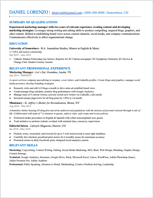
First, to facilitate easy reading, you’ll want to use different font sizes for headers and body content. We recommend titling your five main sections with headings that are slightly larger than the rest of your text. If your body text is 11 pt, make your headings 12 pt, like below:
Additionally, font size numbers are a bit relative, as some typefaces are wider than others. Check out what happens when I switch from Times New Roman to Futura (without changing the font size) for the same resume:
-

Times New Roman -

Futura (2 pages)
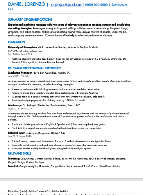
That’s a difference of almost a 1/3rd of a page!
If you want to change the font size on your resume, first make sure your font isn’t the problem. If you’ve already tried everything you can to shorten your resume to fit onto one or two pages, changing to a different font (within the guidelines in this blog) before lowering your font size might be the only change you need.
Font size for different sections
Beyond your body text, the best font size for your resume varies between sections. The official Let’s Eat, Grandma style guide used by our professional resume writers lists that section headers can be larger than your body text, at 12-15 pt font, while your name should be the largest text, anywhere from 16-22 pt font. All components should be consistent as well, so use the same font size for section headers, the same size for job titles, and the same size for locations.
If you’re ever confused on resume font size, just remember that your name is the first place you want your recruiter to look, followed by section titles, and then finally your body. This isn’t to say those initial categories are more important than your resume’s content, but your resume’s content simply wouldn’t make sense without them.
The right font choices for you
Ultimately, the best font for your resume is a personal design choice. Just make sure whatever font you choose is easy to read and consistent across different versions of Word, and that you use an appropriate and consistent font size for each section of your resume.
Your font choice can be a fun way to show your personality. Are you a modern go-getter who values efficiency? A classic, creative type who loves a job well-done? Whatever your personal style, there are lots of fonts to choose from that can leave a great first impression, so get out there and put your best foot (and font) forward!
Ready for more job search help?
Sign up for a free Senior Writer Resume Critique to see what's holding you back from landing interviews. One of our top professional resume writers will give you personalized feedback on the top 3 items you can improve based on our expert practices!